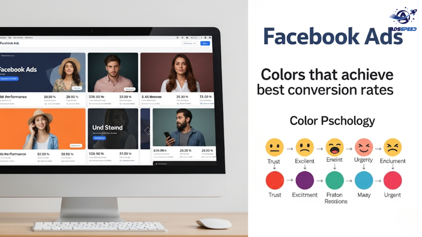

Why Color Matters in Facebook Ads
On Facebook, your ad has milliseconds to grab attention. Before anyone reads your copy or watches your video, their brain reacts to color. That’s why color psychology is a powerful tool in ad design.
The right color palette can:
- Boost visibility in a crowded feed
- Evoke specific emotions
- Guide users toward your CTA
- Increase click-through and conversion rates
Let’s break down which colors work best — and why.
1. Red: Urgency and Excitement
🔴 Red grabs attention fast. It creates a sense of urgency and can increase heart rate — perfect for flash sales or time-limited offers.
Best for:
- “Only 24 hours left” promos
- Event registrations
- Impulse buys
Use sparingly though — too much red can feel aggressive.
2. Blue: Trust and Security
🔵 Blue is calm, professional, and builds credibility. It’s often used by tech, finance, and healthcare brands.
Best for:
- SaaS and service ads
- Products that require trust (e.g., insurance, B2B tools)
- Wellness offers
Tip: Combine blue with white for a clean, reassuring feel.
3. Yellow and Orange: Optimism and Action
🟡 Yellow sparks optimism and grabs attention, while orange encourages action.
Best for:
- CTAs like “Start Free Trial” or “Get Offer”
- eCommerce and seasonal campaigns
- Products targeting younger demographics
But be cautious — yellow can be hard to read on white backgrounds, and orange can sometimes feel “cheap” if overused.
4. Green: Health, Growth, and Freshness
🟢 Green is easy on the eyes and often associated with:
- Nature and eco-friendly products
- Personal growth or education
- Finance and investment
Best for:
- Organic brands
- Coaching and courses
- Fintech solutions
Pairing green with neutral colors like beige or light gray enhances credibility.
5. Black and White: Luxury and Simplicity
⚫ Black suggests elegance and sophistication, while white signals clarity and minimalism.
Best for:
- High-end products (e.g., luxury fashion, tech gadgets)
- Clean, modern ad designs
- Strong contrast for bold CTAs
Use black-and-white schemes with bold fonts and a single pop of color (like gold or red) to highlight key elements.
6. Purple and Pink: Creativity and Femininity
🟣 Purple is often tied to creativity and luxury; pink evokes softness and emotional connection.
Best for:
- Beauty and wellness
- Art and design niches
- Ads targeting women or creative buyers
These colors stand out when used in contrast with neutral tones.
7. CTA Button Color Tips
The color of your Call-to-Action button matters more than you think. Use contrasting colors to make it pop:
- Green or orange buttons on light backgrounds
- Red for urgency
- Blue for trust-based offers
Test different combinations in your campaigns. Tools like Adsspeed or A/B testing in Meta Ads Manager can help identify which palettes convert best for your audience.
🔹 Google Chrome Store: Search “Ads Check Speed | adsspeed.com”
https://chromewebstore.google.com/detail/ads-check-speed-adsspeedc/bhfahbbgppclfpeapkaebjbcffjnahcd
🔹 IOS Download : https://apps.apple.com/vn/app/adscheckspeed/id6742325139
🔹 Android Download : https://play.google.com/store/apps/details?id=com.dev.fbadsspeedv2&hl=vi
Final Tips for Color Strategy
- Consistency matters: Match ad colors with your brand identity
- High contrast boosts visibility
- Always test: Color effectiveness varies by niche and audience
- Avoid color overload — use 2–3 colors max per ad creative